Famly's Redesign
Shaping a design system for a mature product
tl;dr
Problem
Famly’s childcare management platform had years of design debt: inconsistent UI, duplicated components, and slow developer workflows caused by the lack of a unified design system.
Research
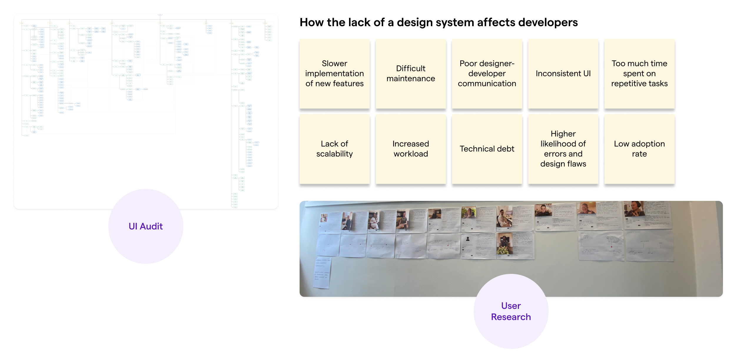
I ran a complete UI audit and facilitated workshops with developers, PMs, and support staff. Findings showed redundant patterns, poor accessibility, and rework cycles that made iteration slow and resource-heavy.
Solution
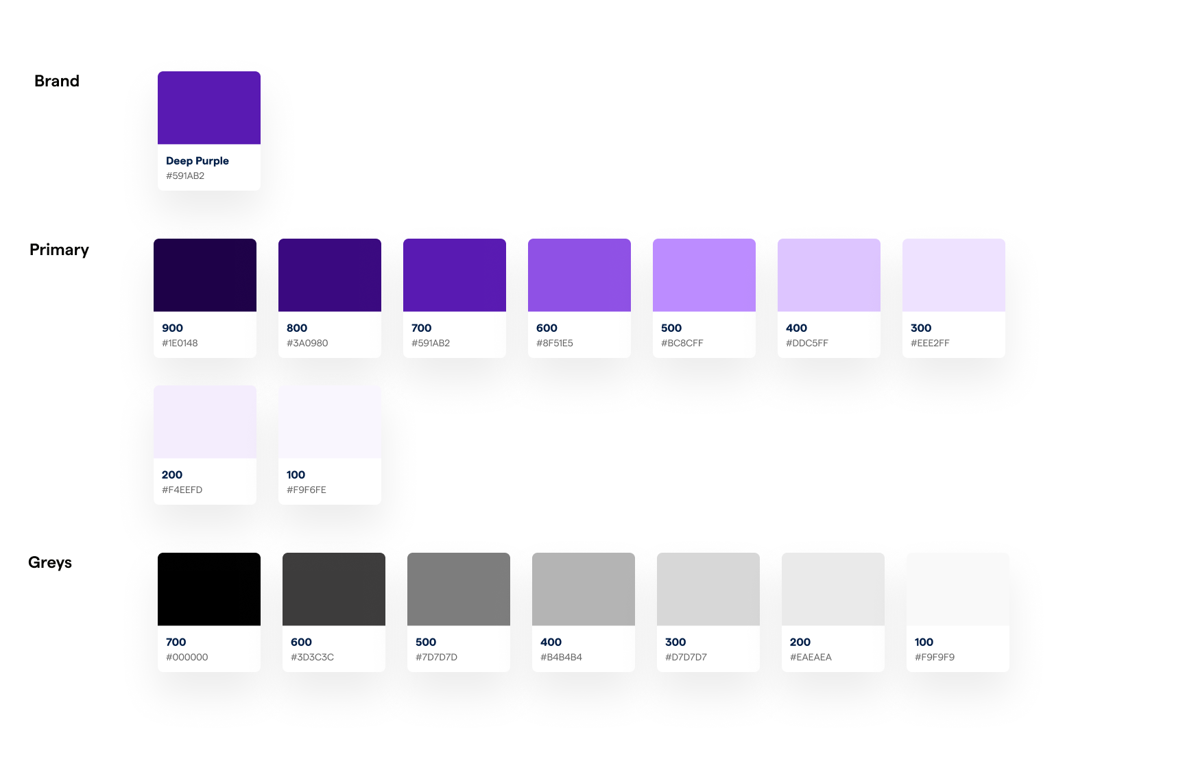
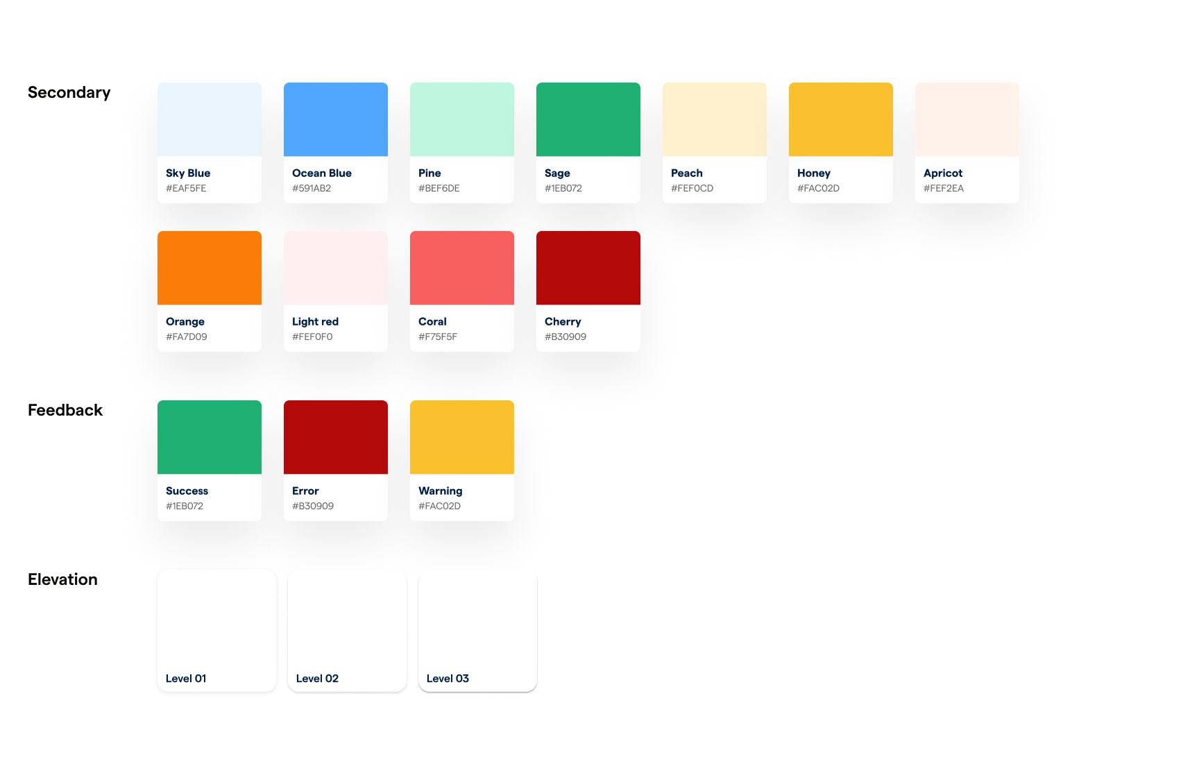
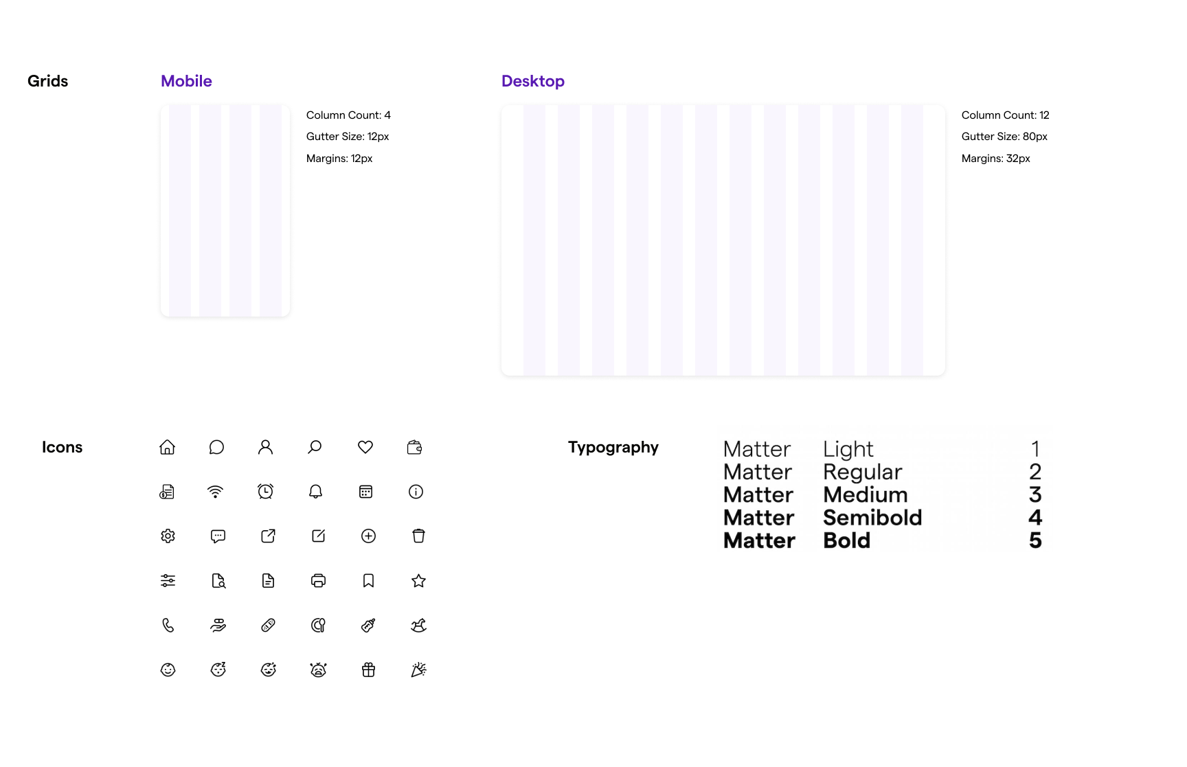
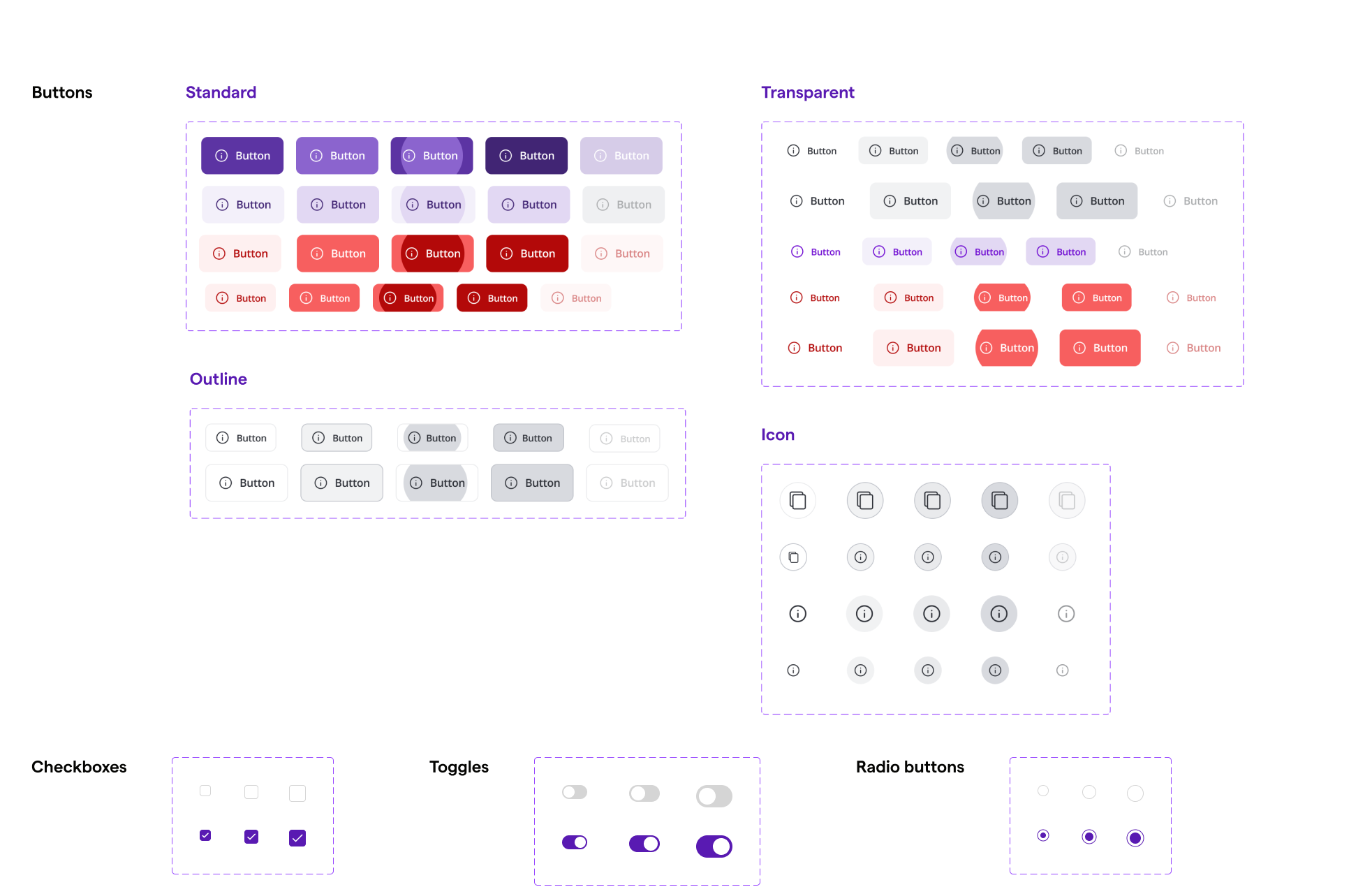
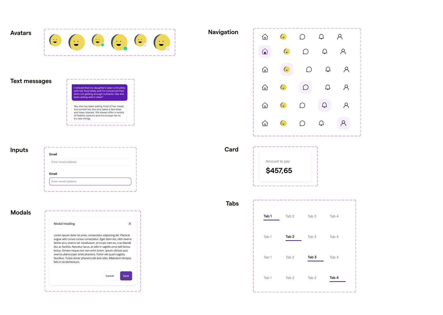
I established a scalable design system using Figma, React, Material Design, and Storybook. The rollout included design tokens (typography, color, spacing, accessibility), standardized components, and detailed documentation. To drive adoption, I introduced weekly company-wide updates, training sessions, and email newsletters that kept all stakeholders informed of new components and guidelines.
Overview
Background
Famly is a childcare management platform designed to streamline communication between educators and parents while handling key operational tasks such as scheduling, attendance, and billing. Founded in 2013, the company initially prioritized engineering over design, leading to an inconsistent and fragmented UI as the platform scaled. Without a dedicated design team in the early years, the product grew organically, accumulating design debt that made maintenance cumbersome and user experience suboptimal.
When I joined Famly, eight years post-foundation, it was clear that the absence of a design system was a bottleneck—causing inefficiencies in development, inconsistencies in the user experience, and friction between design and engineering teams. Leveraging my UX expertise and frontend development knowledge, I helped establish a scalable, robust, and maintainable design system from the ground up.
Problem
Lack of a unified design system
- → UI inconsistencies across the platform, negatively impacting brand perception and usability.
- → A fragmented development workflow where identical components were implemented differently across various parts of the app.
- → Inefficient collaboration between designers and developers due to the absence of a shared design language.
- → Increased technical debt making product iteration slow and resource-heavy.
Goal
Create a single source of truth for both designers and developers.
- → Standardize UI and UX components across the platform.
- → Improve developer efficiency by streamlining implementation.
- → Foster seamless collaboration between cross-functional teams.
- → Enhance the overall user experience through consistency and usability improvements.
- → Establish a scalable system to support future product growth.
“
How can we ensure consistency across the platform?
”
Process
We drew inspiration from the Double Diamond framework to shape our approach, using its principles to inform our process while adapting it to our needs.
Part 1: Discovery
- → Redundant and inconsistent component variations.
- → Mismatched color schemes, typography, and spacing rules.
- → A lack of accessibility considerations in existing designs.
Part 2: Definition
We established the core principles for our design system:We need a design system that standardizes UI and UX components, optimizes development workflows, and enhances overall product consistency.
- → Single Source of Truth - Centralized documentation and assets.
- → Clarity - Improved communication between designers and developers.
- → Efficiency - Faster development cycles and reduced technical debt.
- → Consistency - A cohesive brand and user experience.
- → Scalability - Designed with the future in mind.
Part 3: Development
- → A refined color palette aligning with brand identity.
- → Updated typography for improved readability and hierarchy.
- → Standardized spacing, grid systems, and accessibility enhancements.
- → A comprehensive icon set and refreshed UI components.
Part 4: Delivery and Adoption
Collaborating closely with developers, we systematically replaced outdated UI components with the new standardized elements, ensuring minimal disruption to existing workflows.
Training and DocumentationTo drive adoption, we initiated:
- → Weekly company-wide presentations to introduce new components and updates.
- → A centralized design system documentation hub with detailed guidelines, usage examples, and accessibility considerations.
- → A versioning system to manage updates without disrupting development timelines.
- → Email newsletters to keep all stakeholders informed about major changes.
To gauge the effectiveness of the design system, we tracked key performance indicators (KPIs), including:
- → Development speed - Measured by tracking the reduction in time spent implementing UI components.
- → Bug reduction - Fewer design-related inconsistencies reported post-launch.
- → Designer-developer collaboration - Measured through qualitative feedback and improved alignment in cross-functional teams.
- → User experience - Positive feedback from customers regarding UI improvements.
Results and Impact
The implementation of Famly’s design system yielded significant improvements:
- → 35% reduction in UI-related development times allowing engineers to focus on feature-building instead of fixing inconsistencies.
- → A noticeable decrease in support calls and reduced need for user assistance.
- → Increased design-to-development alignment leading to smoother handoffs and fewer implementation discrepancies.
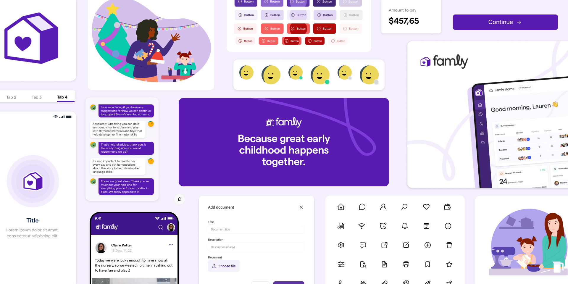
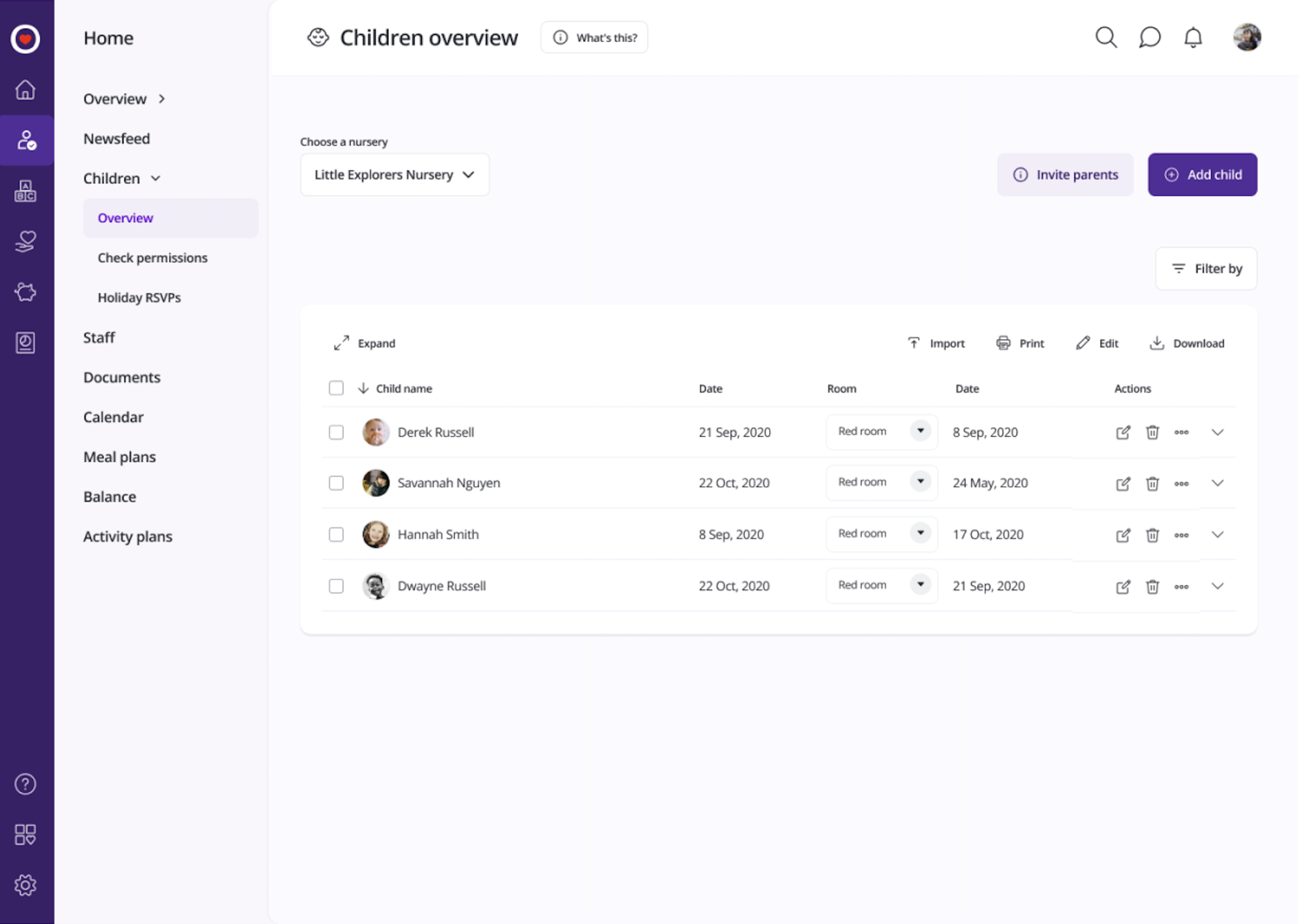
Before/After
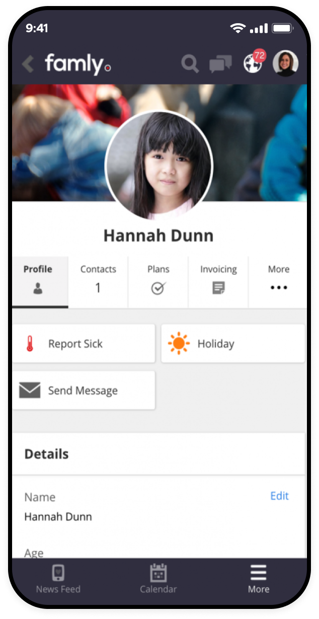
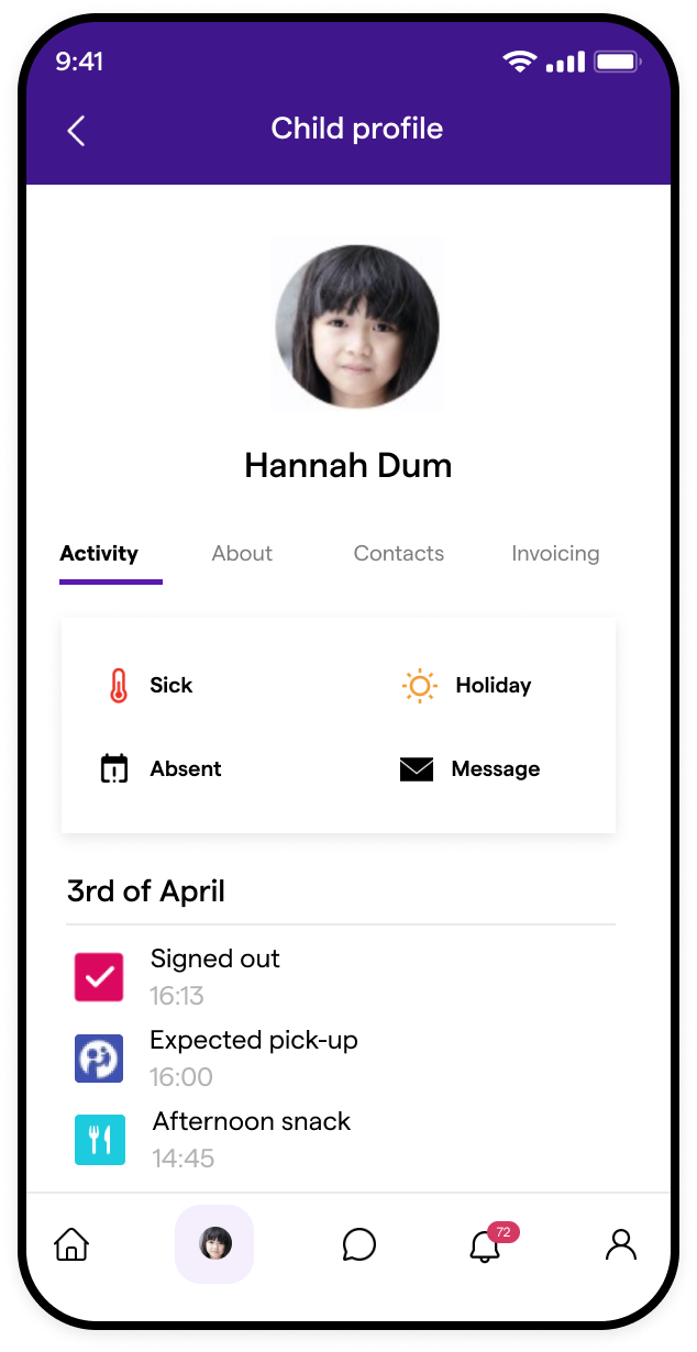
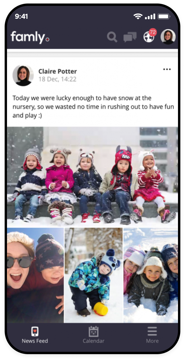
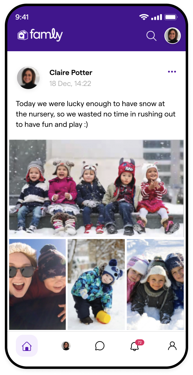
UI in practice
Next steps
Maintaining and Evolving the System
A design system is a living entity, requiring continuous iteration and refinement. While we successfully established a strong foundation, we recognized the ongoing need to:
- → Expand the component library with new elements.
- → Continuously gather feedback from users and developers to optimize usability.
- → Refine accessibility standards to further enhance inclusivity.
- → Explore automation tools to streamline component updates across the platform.
Final Thoughts
This initiative was more than just a visual refresh—it was a strategic shift in how Famly approached design and development. By integrating a structured and scalable design system, we transformed a fragmented UI into a cohesive, user-friendly experience that supports both current operations and future innovations.