Sustainable E-Commerce
Reimagining the checkout flow to reduce packaging waste in online orders
Overview
Problem
Online shopping has boomed in the pandemic, leading to an increased demand for single-use packaging.
The COVID-19 pandemic promoted an uprecedented change in consumption habits due to lockdowns, causing a steep rise in the e-commerce sector. As convenient as it may sound for the regular consumer, the overuse of e-commerce services is one of the major contributors to plastic pollution due to excess packaging being thrown away in huge landfills instead of being repurposed.
Goal
Design a better checkout experience focused on minimizing waste.
“
How can we make buyers adopt a more sustainable mindset?
”
Research
User survey
I started the design process by collecting information from people around me regarding their online shopping habits. In order to collect as many answers as possible, I used an online survey with various questions on the topic of online shopping, to identify how informed they are with regards to sustainability and the negative impact over-shopping can have on the environment. 25 persons completed the the survey.
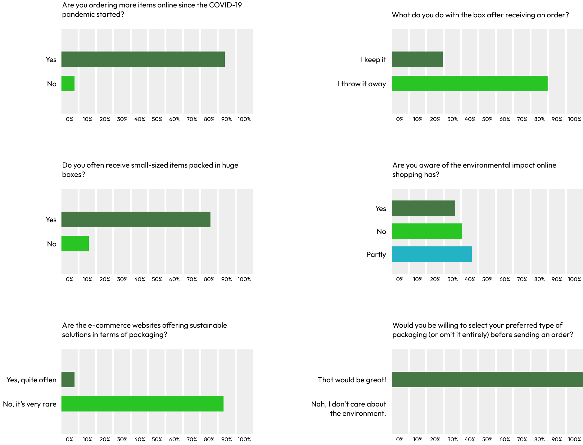
Key mentions in the user survey:
- → People have acknowledged they started ordering more items online and admitted to throwing away most of the boxes.
- → Overpacking is also a common issue among many shoppers as they often get sent packages that are too big for what they ordered.
- → Most of the e-commerce websites have not taken the appropriate measures to reduce single-use packaging yet, even though customers would be open to the idea.
One of the greatest concerns regarding single-use packaging and its harmful effects on the environment is people's lack of knowledge on the topic.
Most subjects have stated that even though they are aware online shopping is bad for the environment, they are unaware how bad it actually is and where does packaging waste end up.
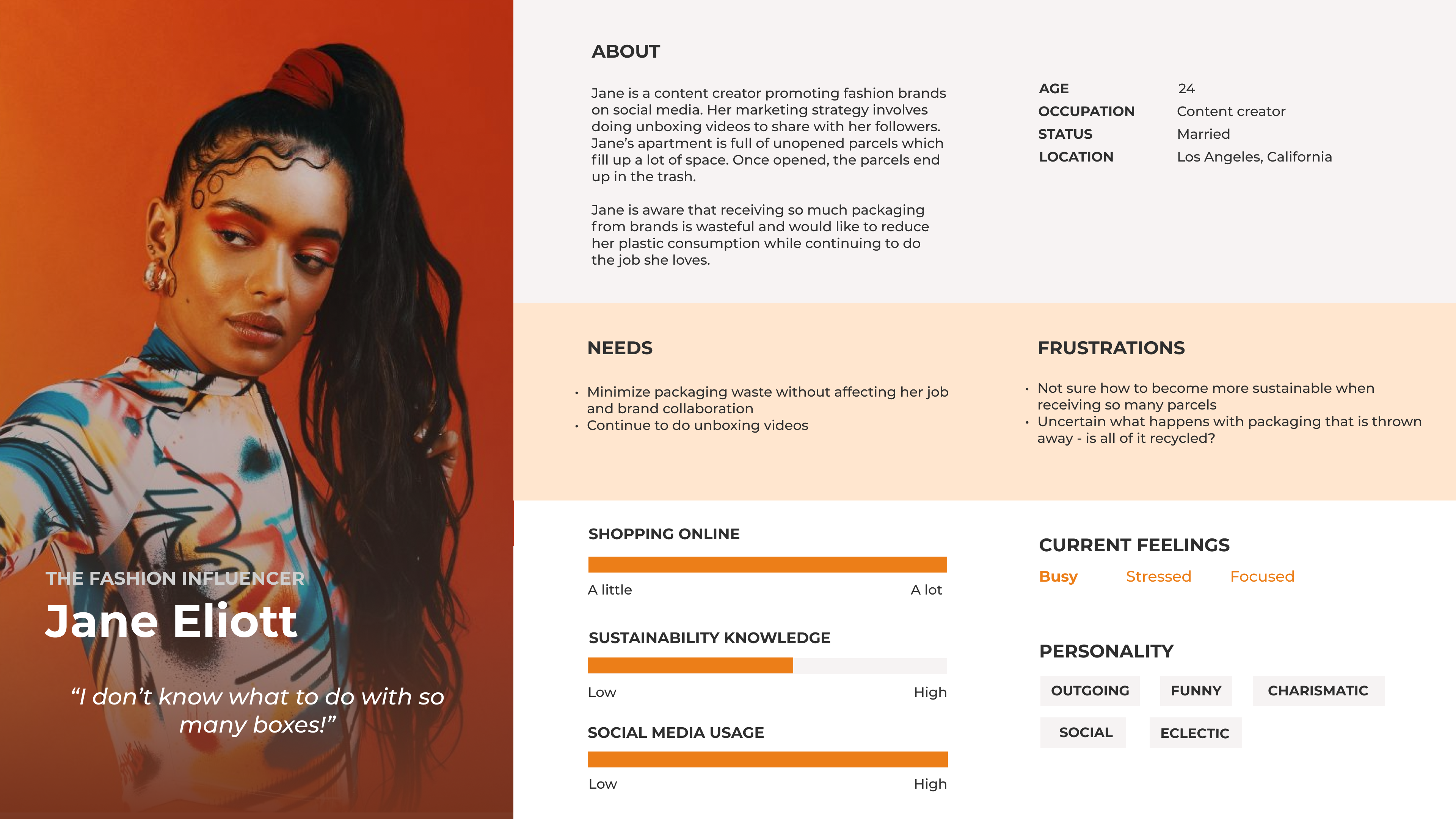
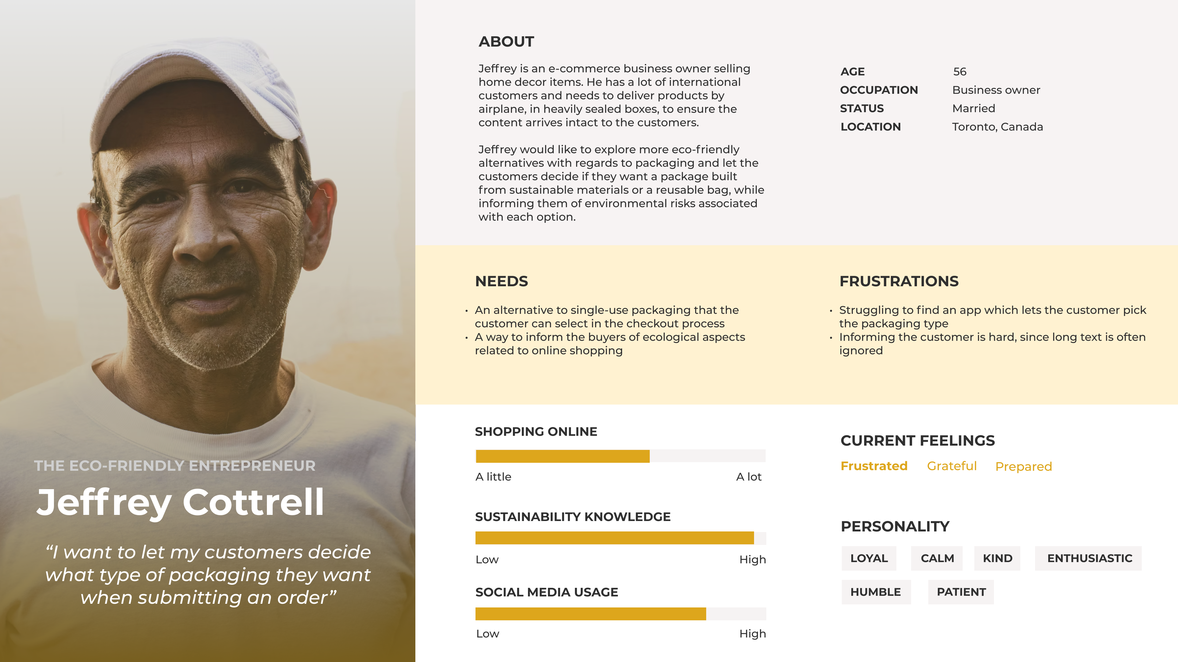
Personas
Defining online buyers
After researching, I created two personas that best shape the potential users of this app, along with their needs and frustrations. I concentrated on two types of users: online order consumers and e-commerce business owners.
Throughout the rest of the design process, I focused on solving their problems and come up with an improved checkout concept when shopping online for an item, that would benefit both user segments.
User flow
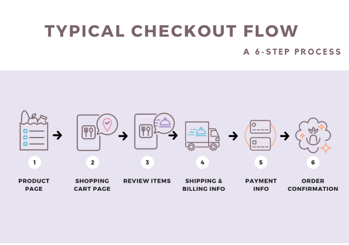
How does a checkout flow look like?
I continued by researching the structure of a typical checkout experience on mobile when purchasing items online. Most e-commerce apps have 6 checkout screens, as depicted in the following image (courtesy of BSS Commerce)
Ideation & wireframing
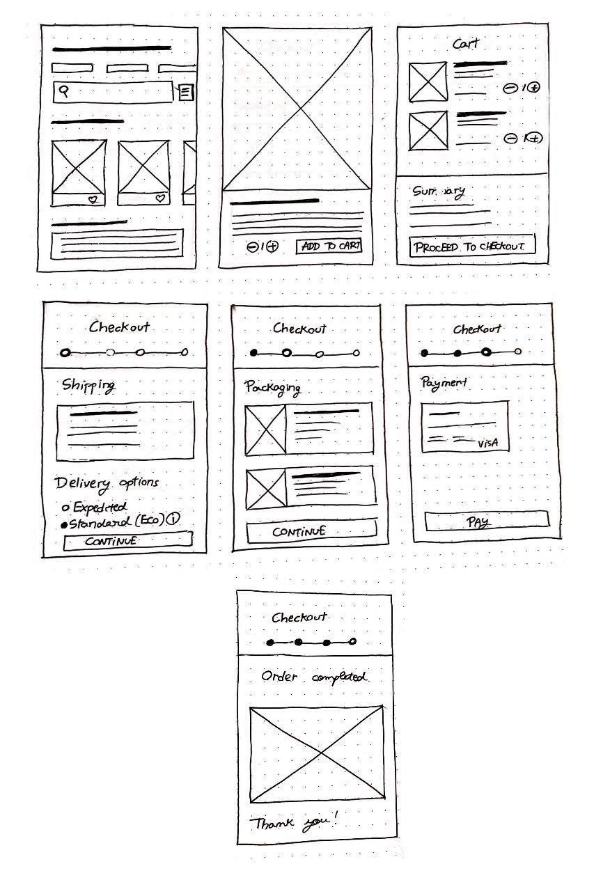
I had an idea in mind on how to design the checkout flow, which I sketched on paper.
My main goal was to create a customizable experience for the users where they decide
what options suit them best in terms of delivery and packaging, while making them aware
of their environmental footprint.
Strategy
A little goes a long way.
That's the principle upon which I redesigned the e-commerce checkout experience for improving sustainability. I tried making customers aware of environmental risks associated to their shopping choices by embedding small snippets of information associated to ecological waste. Besides educating online shoppers on sustainability, I also came up with a reward system that grants customers discounts if they choose the greener options for their delivery.
Informational rewards satiate a user's curiosity.
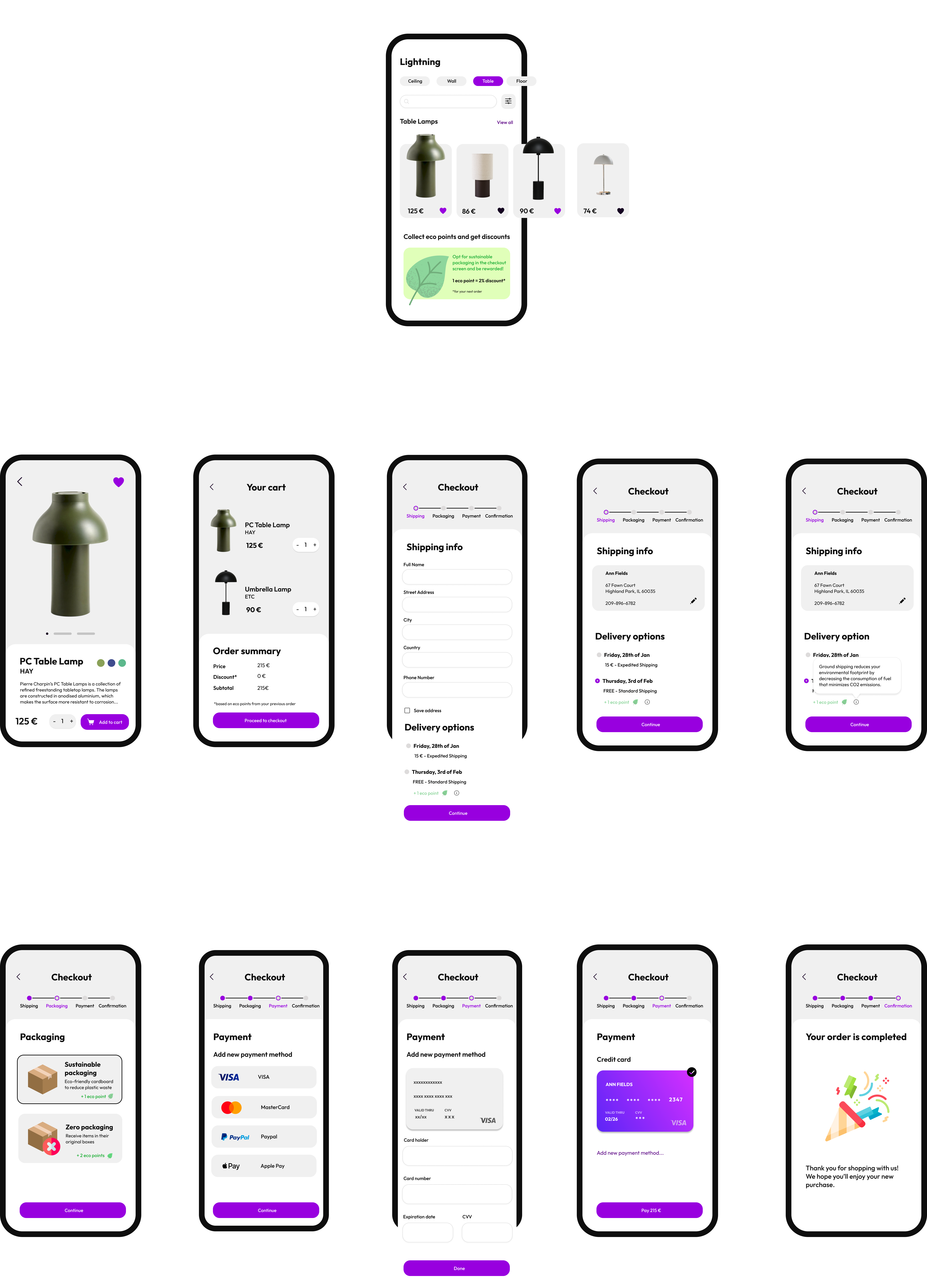
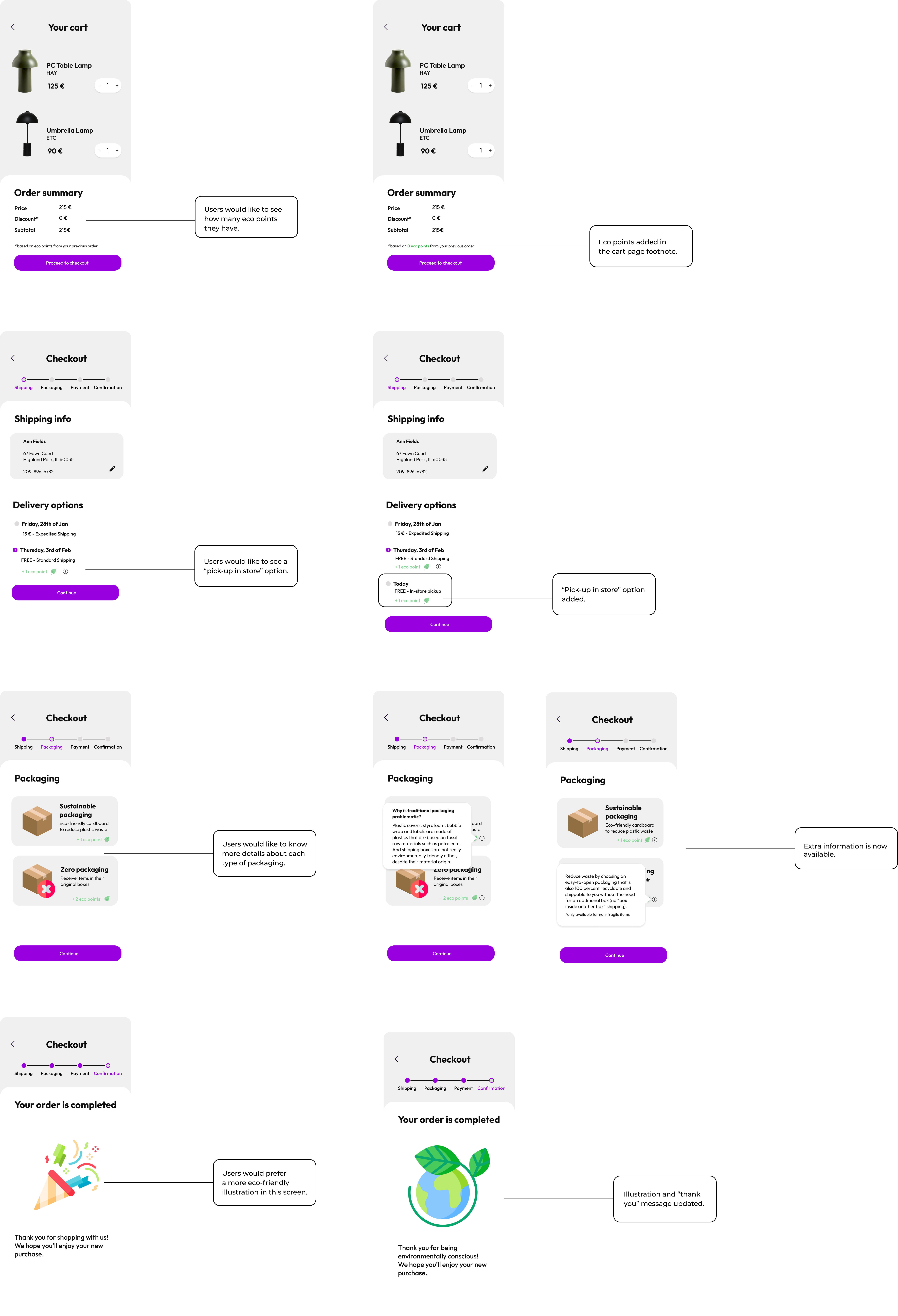
The reward system I came up with consists of "eco points" that the buyer receives whenever he opts for a planet-friendly option for delivery or packaging. As advertised in the banner (first screen - bottom), eco points can be used to get discounts in the next order.
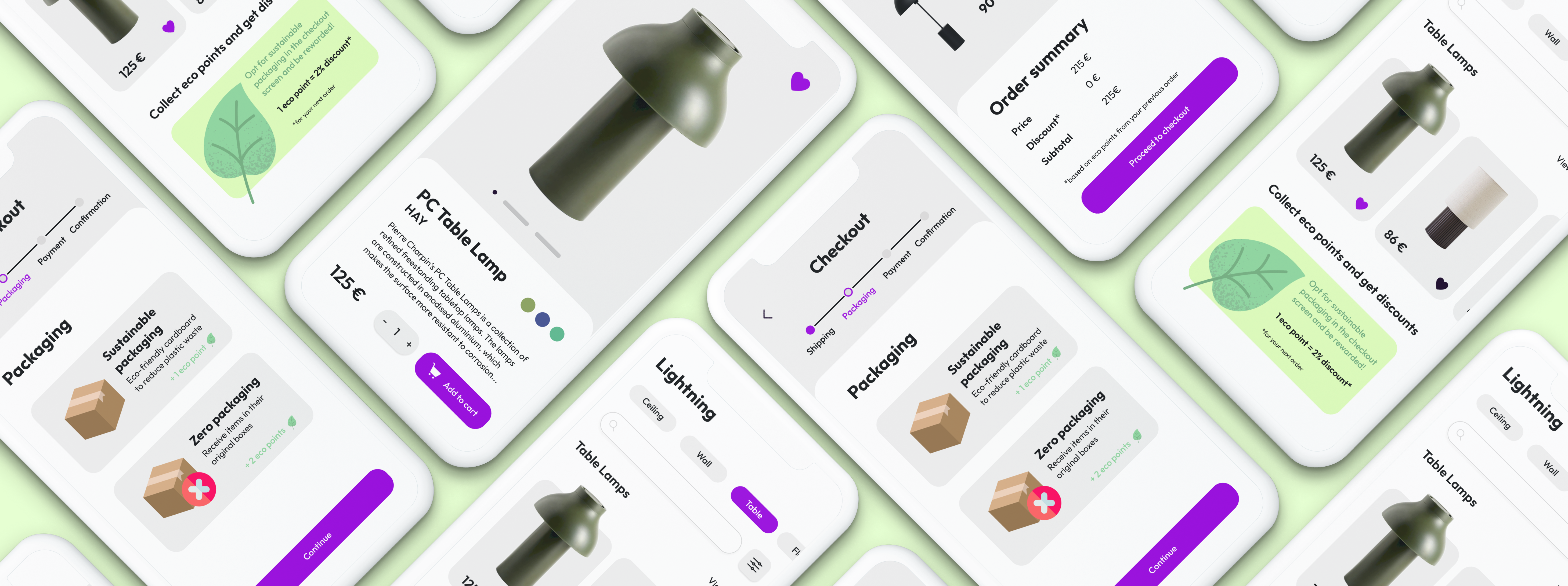
The checkout experience consists of 6 screens, namely:
- → Product page - where the user has the option to read more details about a certain item and add it to cart
- → Cart page - displaying all the items that were added to cart and the subtotal price (excluding the shipping fee)
- → Checkout screen I: Shipping - here the user adds the home address and picks a delivery option (either expedited or standard, being informed by the app that standard delivery is more sustainable); if ground shipping is selected, the user gets eco points
- → Checkout screen II: Packaging - here the user can opt for sustainable packaging or zero packaging, being rewarded with eco points accordingly
- → Checkout screen III: Payment - here the user can add payment information and confirm payment for the order
- → Checkout screen IV: Confirmation - screen notifying the user that the order was successfully submitted
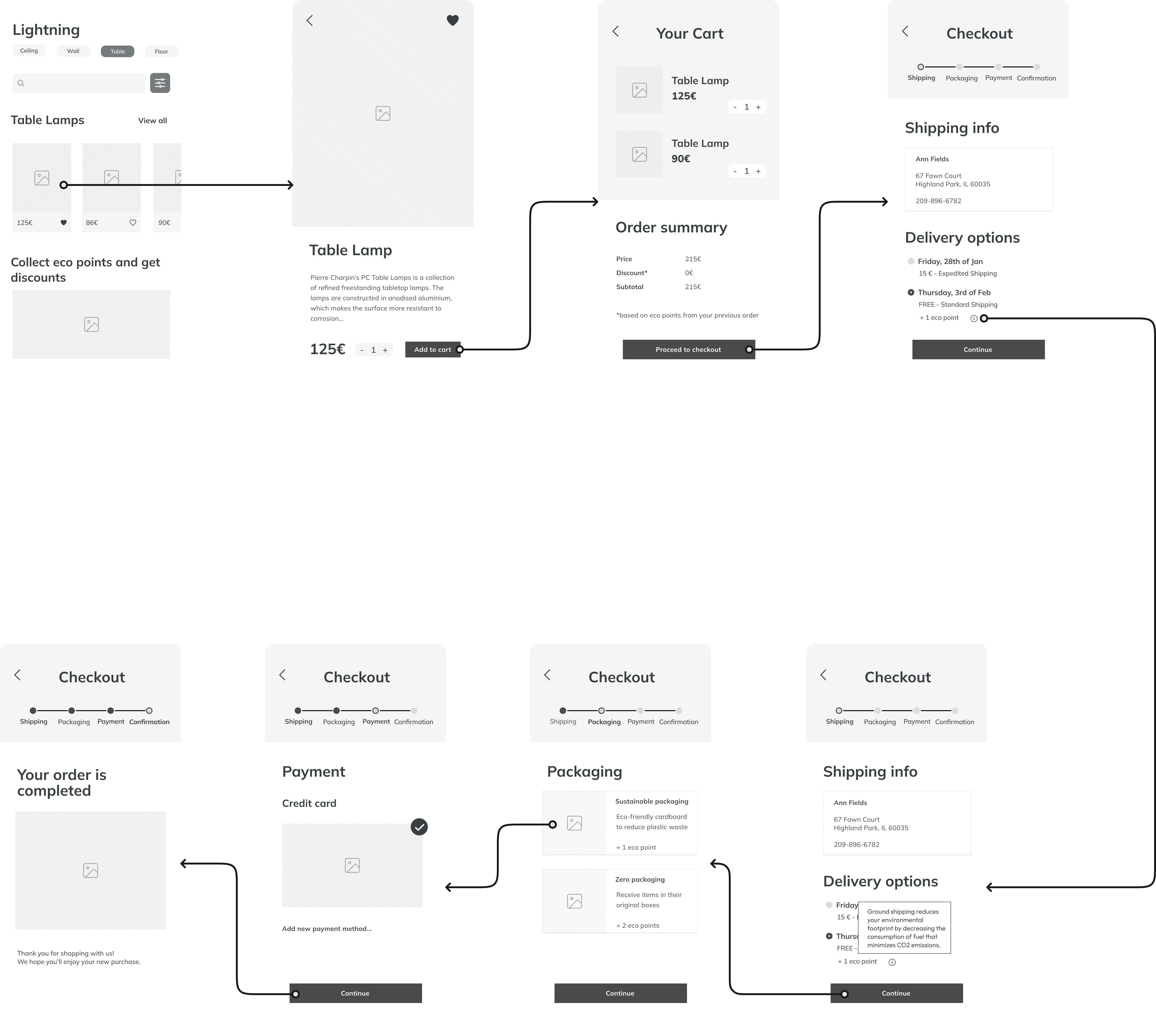
Mid-fidelity prototype
High-fidelity prototype
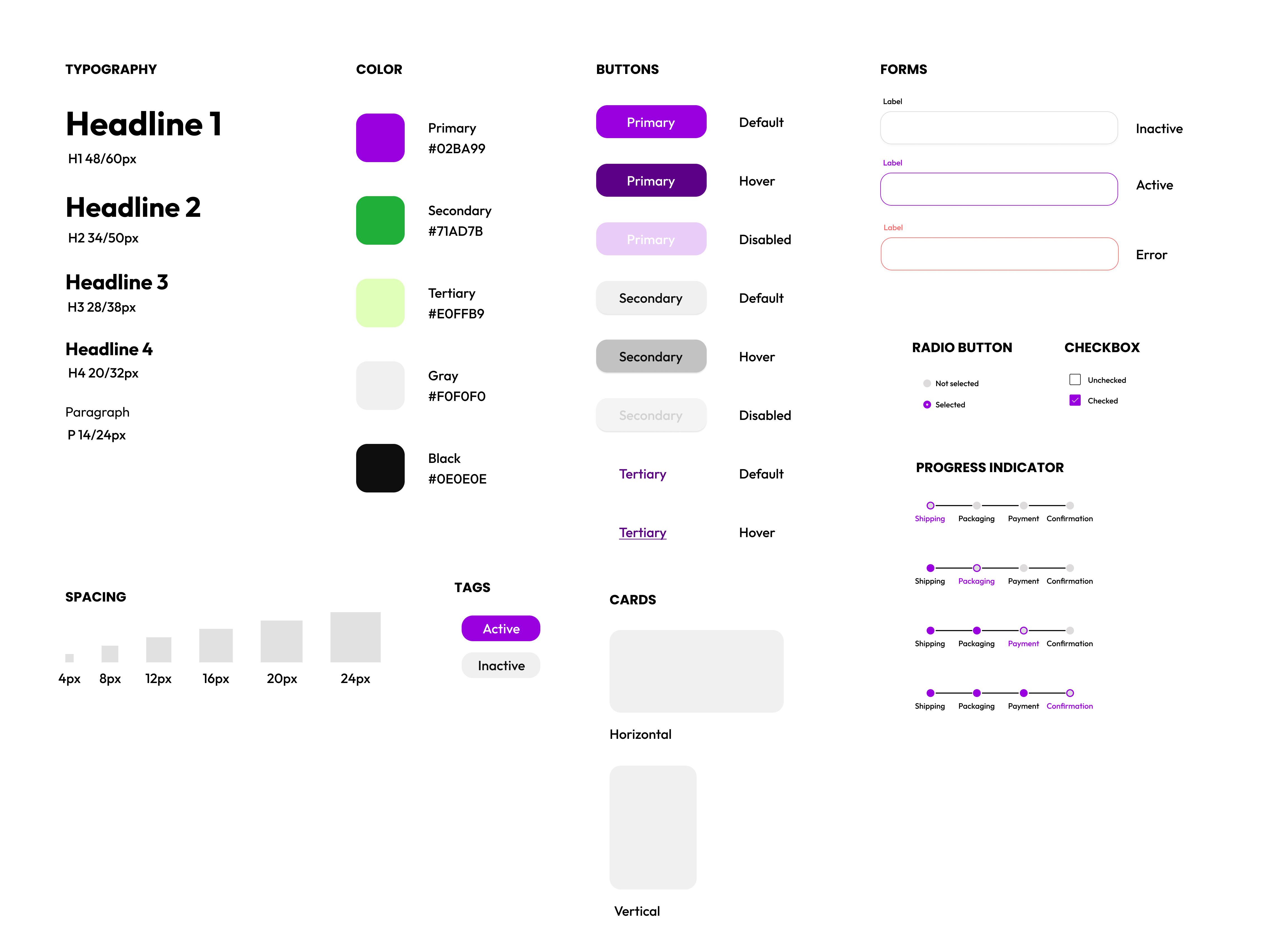
Design system
User testing
Validating assumptions
After creating the high-fidelity prototpe, I conducted usability testing with five participants (face to face). My main goal was to detect whether the participants found the eco-points rewarding system powerful and if they learnt new things about sustainable shopping while navigating through the checkout screens. There were no tasks prepared and during the interviews I payed close attention to the participants' reactions when they interacted with the checkout screens. The participants were asked to think out loud. On the whole, the prototype met its purpose, but it also generated a few concerns, as detailed in the feedback grid below.
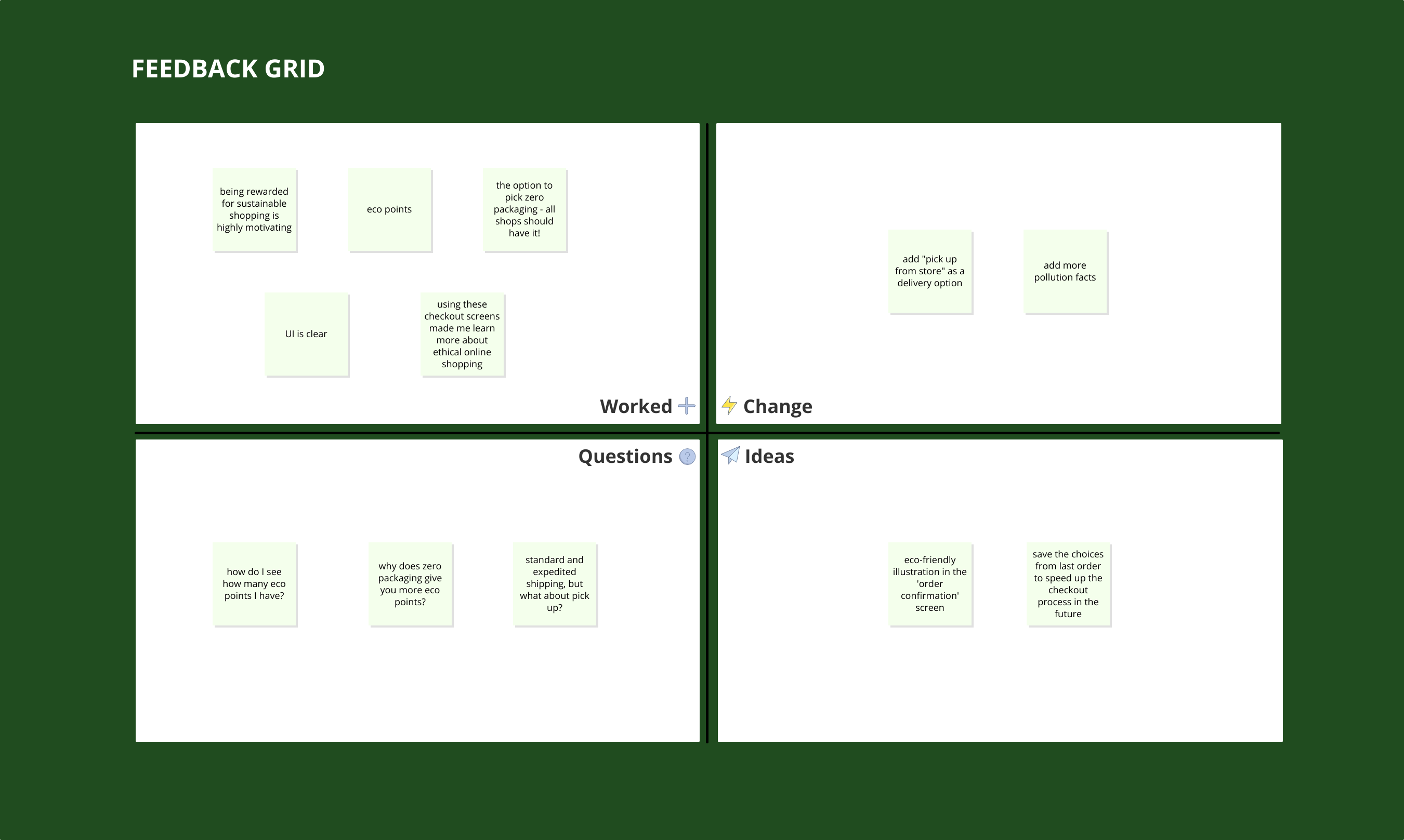
Revision
Reflection
This project allowed me to learn more about UX design in e-commerce. Even though the presented solution is a specific case that cannot be applied to all online stores due to differences in logistics, the central idea stays the same - users should be informed of the environmental impact associated to their online purchases and rewarded with small bonuses where possible.
Future iterations
If I were to continue expanding the checkout screens, I would:
- → add numerical statistics or illustrations instead of textual facts to increase awareness
- → find a way to reduce the number of checkout screens
- → replace the tooltips with fullscreen modals to include more facts