Visual Exploration of Time Series
Medical dashboard for doctors and patients
Overview
Problem
Healthcare professionals need an easy-to-use tool for analyzing their patients' data.
Sharing self-tracked data with others to seek treatment or solutions to a problem led to an ever growing number of healthcare professionals who must rely on time-dependent visualizations to help their patients. Although they may be knowledgeable in their field, not all of them are computer experts, hence they need an easy-to-use tool in order to analyze and extract relevant information from the data under investigation.
Goal
Deliver a web application capable of generating time series visualizations rich in information and easy to interact with.
By using quantified-self data collected from real subjects, the goal of the project is to help newcomers discover meaningful patterns in their datasets, with minimum effort and maximum results.
“
How might we extract meaningful patterns from temporal data with minimum effort and maximum results?
”
Analysis
Target users
There are two groups of people who usually engage in a self-monitoring process:
Private Self-Trackers
Individuals who voluntarily track for personal reasons.
Pressured Self-Trackers
Those who engage in self-tracking due to social, workplace, or medical pressure.
This tool focuses on the second category, hence it involves many different actors (e.g. patient and medical practitioner) and aims to improve the communication between them through visual aids.
Use-case scenario
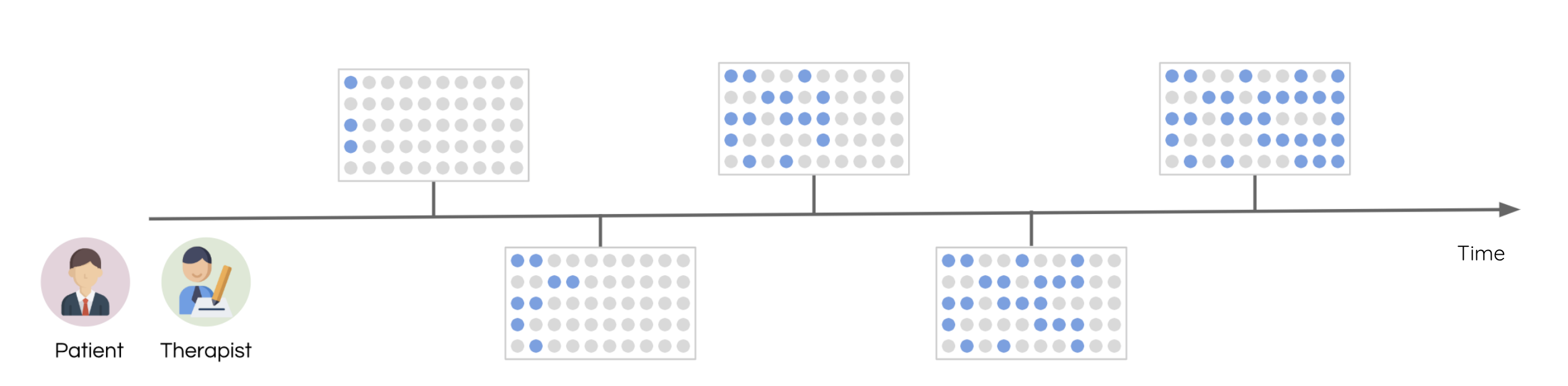
This application primarily focuses on solving problems from the healthcare industry and helps medical entities diagnose and treat their patients. For instance it could be used by a PTSD patient who is regularly attending therapeutic sessions. Each time he encounters outbursts, he records the episodes using a one-button device and shares the collected data with his therapist for a better diagnosis and treatment.
Design
System overview
Each dataset belongs to a real person who - at some point - tracked specific events in his/her life. The data was recorded with the help of a one-button device that when pressed, stored the corresponding timestamp in a CSV file.
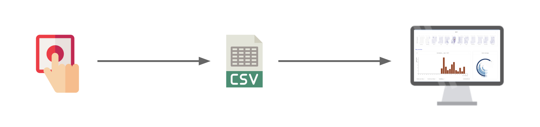
A timestamp is a sequence of characters encoding time-oriented information. In this project, all timestamps have a common structure: YYYY-MM-DDTHH:mm:ss, where YYYY-MM-DD represents the date and HH:mm:ss is the hour when the observation occurred.
By relying on data visualization techniques, the main goal of the system is to help users quickly identify patterns, reflect on them and gain useful insights.
Use-case scenario
This application primarily focuses on solving problems from the healthcare industry and helps medical entities diagnose and treat their patients. For instance it could be used by a PTSD patient who is regularly attending therapeutic sessions. Each time he encounters outbursts, he records the episodes using a one-button device and shares the collected data with his therapist for a better diagnosis and treatment.
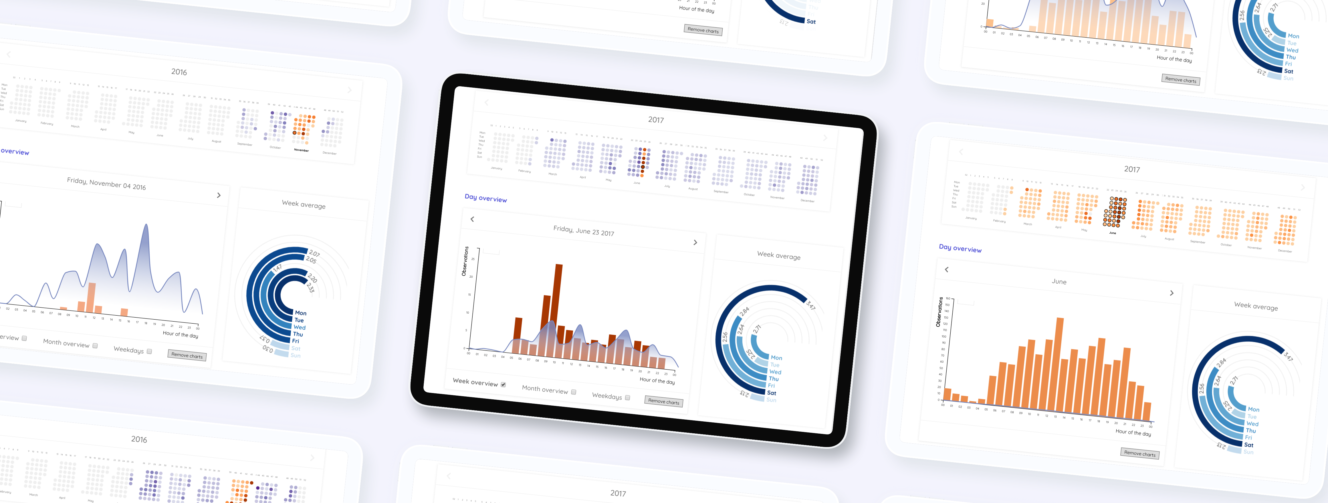
App overview
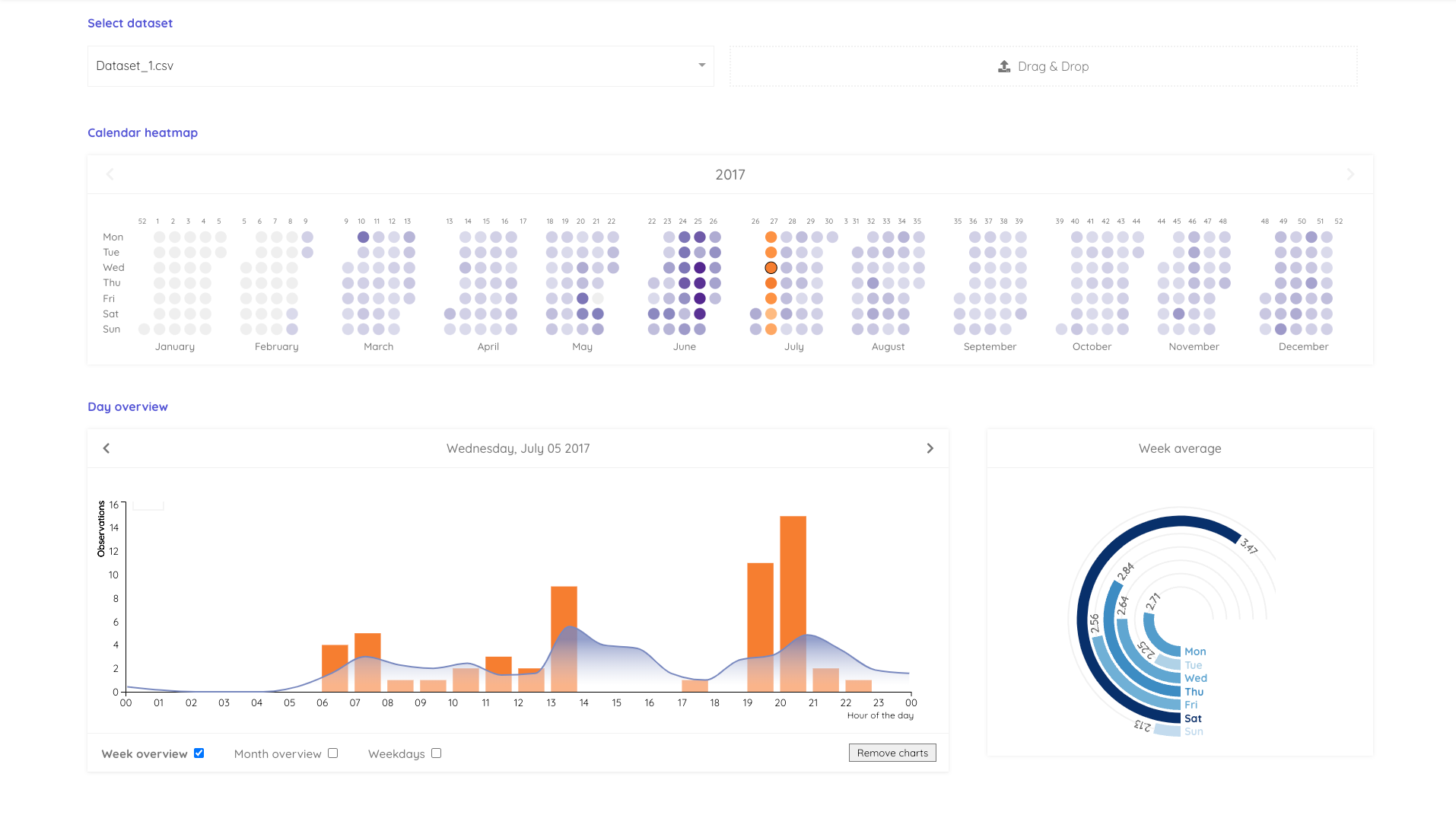
This time-series visualization is the result of 3 major components strongly tied together:
- → Calendar heatmap - The central component on which this prototype is based, showing the concentration of events over the year. The weekdays, week numbers, individual days and month names are clickable and will update the bar chart below with corresponding data. There is also a hidden shortcut for allowing users to compare 2 elements between each other by clicking on the first one and shift-clicking the second.
- → Bar chart - It shows the time-of-day variation of the self-tracked events. When any of the 3 checkboxes is checked, an area chart is rendered on top to compare the selected day to other days in the same week, month or weekday. The more observations registered, the darker the color of each bar.
- → Radial chart - It shows the most impactful weekdays from the entire dataset and supports mouse-over effects when inspecting each circular bar - it will highlight the corresponding weekday in the calendar heatmap.
User testing
Setting the stage
The usability test was carried out on four persons and two datasets were used. In the first one, 5,743 observations were recorded, whereas the second presented 647 timestamps. Both datasets belong to real persons who - at some point - tracked specific events in their lives using the one-button device.
The tasks
The survey consisted of 10 questions which covered most of the functionalities implemented in the visualization. The first half of the questions was based on the first dataset and the rest on the second. There were plenty of tasks to perform with various levels of difficulty. For finding out what the subjects were thinking while answering the questions, they were asked to think out loud and explain their actions.
On the whole, the users enjoyed playing with the visualization and completed the survey without experiencing major difficulties.
Analysis of the results
Overall, the calendar heatmap was intuitive and posed no major problems. In terms of the bar chart, it was easy to interpret the meaning of each bar, and the subjects enjoyed the animation that showed up when switching from one day to another. The radial chart served its purpose too.
The most challenges were faced during the interaction with the area graph, plotted over the bar chart.
Although the participants were informed what kind of values it displayed, they were reluctant to use it during the evaluation and would rather rely on the heatmap or bar chart to find the correct answers.
Lessons learned
Reflecting on the survey results, it can be deduced that even though the time-series visualization looks simple at first sight, it is actually not so easy to decipher the meaning of all values being displayed. The most important lesson that I learned was that
The novice user is reluctant to using overlapping plots and would prefer two simple charts instead of a more advanced one.
Besides, hidden shortcuts often get overlooked and the users don't benefit fully from the app. Besides, hidden shortcuts often get overlooked and the users don't benefit fully from the app.
Open website